21. Pathway Analysis#
21.1. Introduction#
A typical output from a high-throughput experiment is a list of genes, transcripts, or proteins. Given this list, one might want to identify common functions among these analytes. Here, pathway analysis has become a go-to method for associating functions with experimental findings. Such analysis provides essential insights into the complex relationships among biological molecules and how they contribute to specific cellular functions. A pathway represents a set of biochemical reactions and interactions that take place within a cell or organism, involving metabolites, genes, and proteins. Understanding these pathways allows researchers to link molecular changes to phenotypic outcomes, such as disease states or responses to treatment.
21.2. Pathway Databases#
Examples of commonly used pathway databases include KEGG, Reactome, WikiPathways, and BioCyc, which provide curated pathways for metabolic and signaling processes across various organisms. For specialized needs, researchers use databases like MetaCyc for metabolic pathways, SIGNOR for signaling networks, and CTD for studying toxicogenomic interactions. Although not formally a pathway database, Gene Ontology (GO) is often utilized alongside pathway-based methods to identify enriched biological processes, cellular components, and molecular functions from gene or protein lists.
21.2.1. KEGG#
The Kyoto Encyclopedia of Genes and Genomes (KEGG) is a manually curated database that integrates genomic, chemical, and systemic functional information into comprehensive pathway maps, including metabolic and regulatory pathways. KEGG pathways are depicted in graphical diagrams, facilitating the visualization of molecular interactions and their roles in specific biological functions.
21.2.2. Reactome#
Reactome is a detailed, open-source, manually curated knowledge base that provides information about cellular processes like metabolic reactions and immune system functions. Reactome focuses on the relationships between genes, proteins, and other molecules, offering more granular details about molecular interactions than KEGG.
21.3. Over Representation Analysis (ORA)#
One of the basic approaches to pathway analysis is Over Representation Analysis (ORA). ORA identifies pathways that are statistically overrepresented in a list of differentially expressed genes or proteins compared to what would be expected by chance. ORA assumes that the input list contains genes of particular interest, such as those identified through an experiment involving transcriptomics or proteomics.
21.3.1. Fisher’s Exact Test#
A common statistical method used for ORA is Fisher’s exact test, which is designed to determine if there are nonrandom associations between two categorical variables. In the context of pathway analysis, Fisher’s exact test can be used to assess whether the number of genes from a given pathway in the input list is significantly larger than what would be expected by random chance. The null hypothesis in this context is that a gene in the pathway is as probable to appear in the gene list as it is to appear in the non-list.
Consider the following contingency table:
In Pathway |
Not in Pathway |
Sum |
|
|---|---|---|---|
In Gene List |
\(a\) |
\(b\) |
\(a+b\) |
Not in Gene List |
\(c\) |
\(d\) |
\(c+d\) |
All Genes |
\(a+c\) |
\(b+d\) |
\(a+b+c+d\) |
We expect the fraction of genes in the overlap between the pathway and a gene list to all genes, is just a multiplication of the fractions of genes in the pathway and the fraction of genes in the genelist. Any deviation from tha fraction is an enrichment, i.e. an overrepresentation of genes compared to what would be expected by chance. To calculate the significance of such an enrichment, we start by considering the number of combinations of ways to pick genes from the input list and pathway using choose notation. The probability of observing a particular outcome can be expressed as:
Expanding the binomial expressions, we have:
Simplifying this further, we get:
This represents the probability of picking \(a\) genes in, and \(c\) genes not in the pathway from the gene list. To calculate the \(p\) value, we need to consider not just this particular outcome, but also all more extreme outcomes, i.e., those with an equal or more imbalanced distribution. Thus, the \(p\) value is obtained by summing the probabilities of all outcomes that are at least as extreme as the observed outcome:
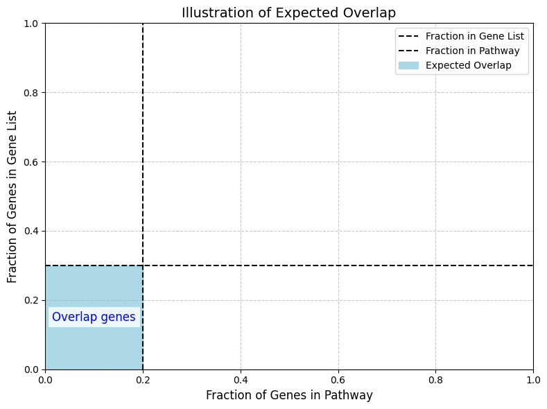
Above is an illustration of the expected overlap (6%) of a pathway consisting of 20% of all genes and a gene-list of 30% of all genes.
21.4. Gene Set Enrichment Analysis (GSEA)#
Gene Set Enrichment Analysis (GSEA) is a more sophisticated pathway analysis method compared to ORA, in that it makes use of quantative information. Unlike ORA, which relies on a predefined threshold to determine differentially expressed genes, GSEA considers the entire list of genes, sorted on differential abundances.
In GSEA, gene sets corresponding to known biological pathways are tested for their enrichment at the top or bottom of a ranked gene list, typically based on differential expression scores. The idea is to determine whether the genes in a given pathway tend to be overrepresented among the most up- or down-regulated genes.
21.4.1. Enrichment Score#
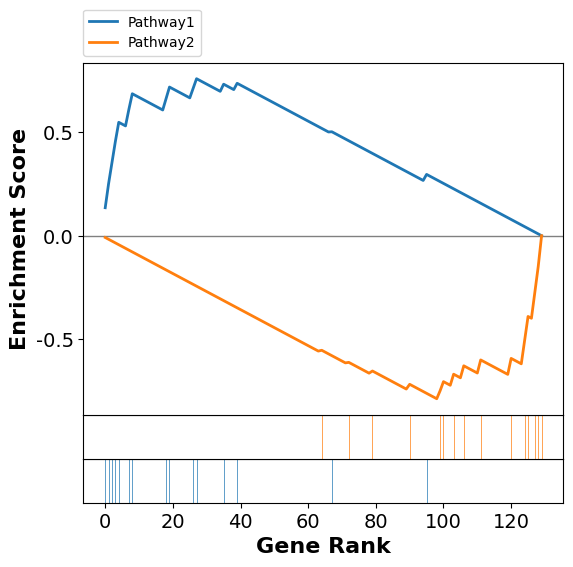
GSEA works by calculating an enrichment score (ES), which quantifies the maximnal differences between the observed and expected cumulative distributions of gene ranks of the genes in a pathway; i.e. how unevenly distributed the genes from the gene set of interest appear in the list of all genes. Starting at the top of the ranked gene list, an enrichment score is computed by walking down the list, increasing when a gene is in the gene set and decreasing otherwise. I.e. it reflects how many genes encountered as compared to what you would expect if they were uniformly distributed among the genes.
Here is an illustration of the enrichment score. We generate a normal-distributed dataset of 30 samples covering 130 genes. We also include 30 genes that are from two pathway, that we simulate as “regulated” i.e. an additional random offset between the “Healthy” and the “Sick” samples, but in oposite direction. GSEA ranks the data and displays the position of the genes in the pathway as colored vertical lines among the genes not in the pathway, which are shown as white lines. If the colored vertical lines were evenly distributed the enrichment of the pathway genes would be zero, however, we devised the test in such a way that the colored vertical lines are more to the left of the distribution. This results in an increased enrichment score for the low ranked genes.
| Name | Term | ES | NES | NOM p-val | FDR q-val | FWER p-val | Tag % | Gene % | Lead_genes | |
|---|---|---|---|---|---|---|---|---|---|---|
| 0 | gsea | Pathway2 | -0.78626 | -2.045313 | 0.0 | 0.000502 | 0.000585 | 11/15 | 24.62% | Pathway2Gene15;Pathway2Gene7;Pathway2Gene3;Pat... |
| 1 | gsea | Pathway1 | 0.757074 | 1.87654 | 0.001004 | 0.002991 | 0.003 | 11/15 | 21.54% | Pathway1Gene2;Pathway1Gene8;Pathway1Gene7;Path... |
To assess the statistical significance of the observed enrichment score, GSEA uses a sampling distribution of ES obtained through permutation. The ranked gene list is shuffled many times to generate a background distribution of ES values, which can then be used to calculate the p-value for the observed enrichment score.
For a more detailed explanation of the enrichment score, please check out the original paper, Subramanian, et al..
21.4.2. Kolmogorov-Smirnov (KS) Test#
The Kolmogorov-Smirnov (KS) test is a non-parametric test that measures the maximum deviation between the observed cumulative distribution of the gene set and the expected distribution under the null hypothesis. In GSEA, the enrichment score is effectively the maximum deviation encountered as we move down the ranked list, capturing whether genes from the pathway are found disproportionately at the top or bottom of the list. This score is then compared against the null distribution to determine statistical significance.
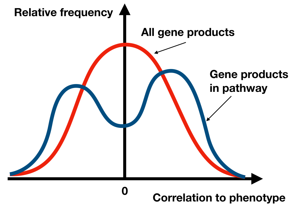
Fig. 21.1 GSEA is using a KS-like test to evaluate if the expression of the genes in a pathway differs significantly from other genes expression pattern between the phenotypes (e.g. “Healthy” or “Disease”).#
The test used in GSEA is in principle a Kolmogorov-Smirnov (KS) test. However, the authors are resigning to a slower permutation test, but the basics of the test statistics is similar. GSEA also corrects for multiple testing by calculating false discovery rates (FDRs).